A sleek note-taking app designed with minimalism in mind
Revised (May 2022)
I have revised and improved the project that I have done in school based on what I would have done if I had more time at the time. What I have improved is below: ✓ Employed the design system and grid layout on the design ✓ Made improvements on UI & prototype interactions ✓ Revised user persona & usability testing report
Overview
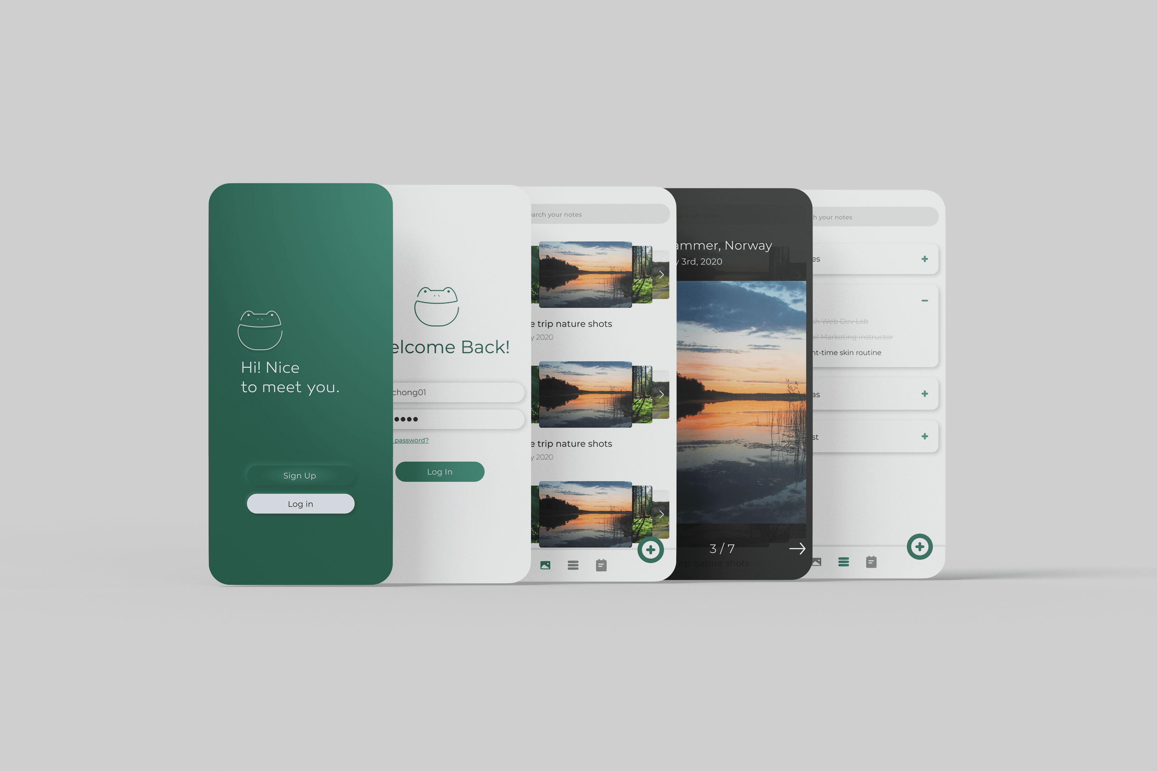
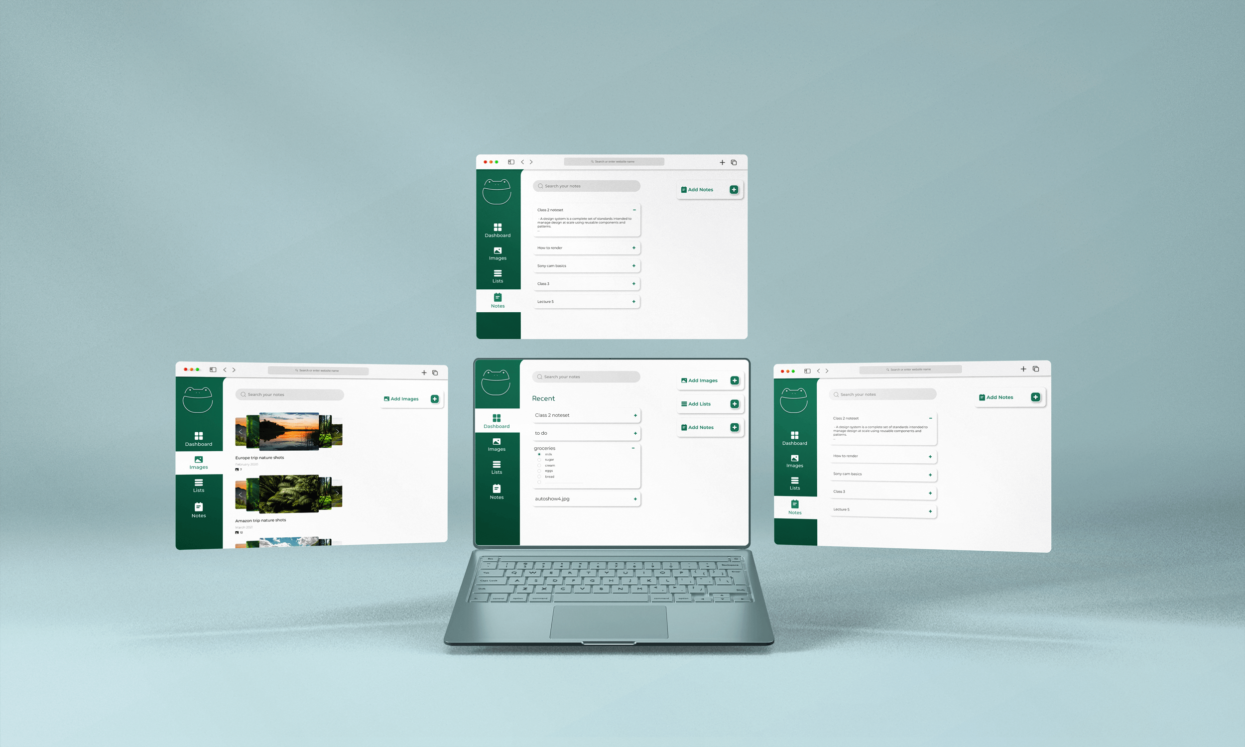
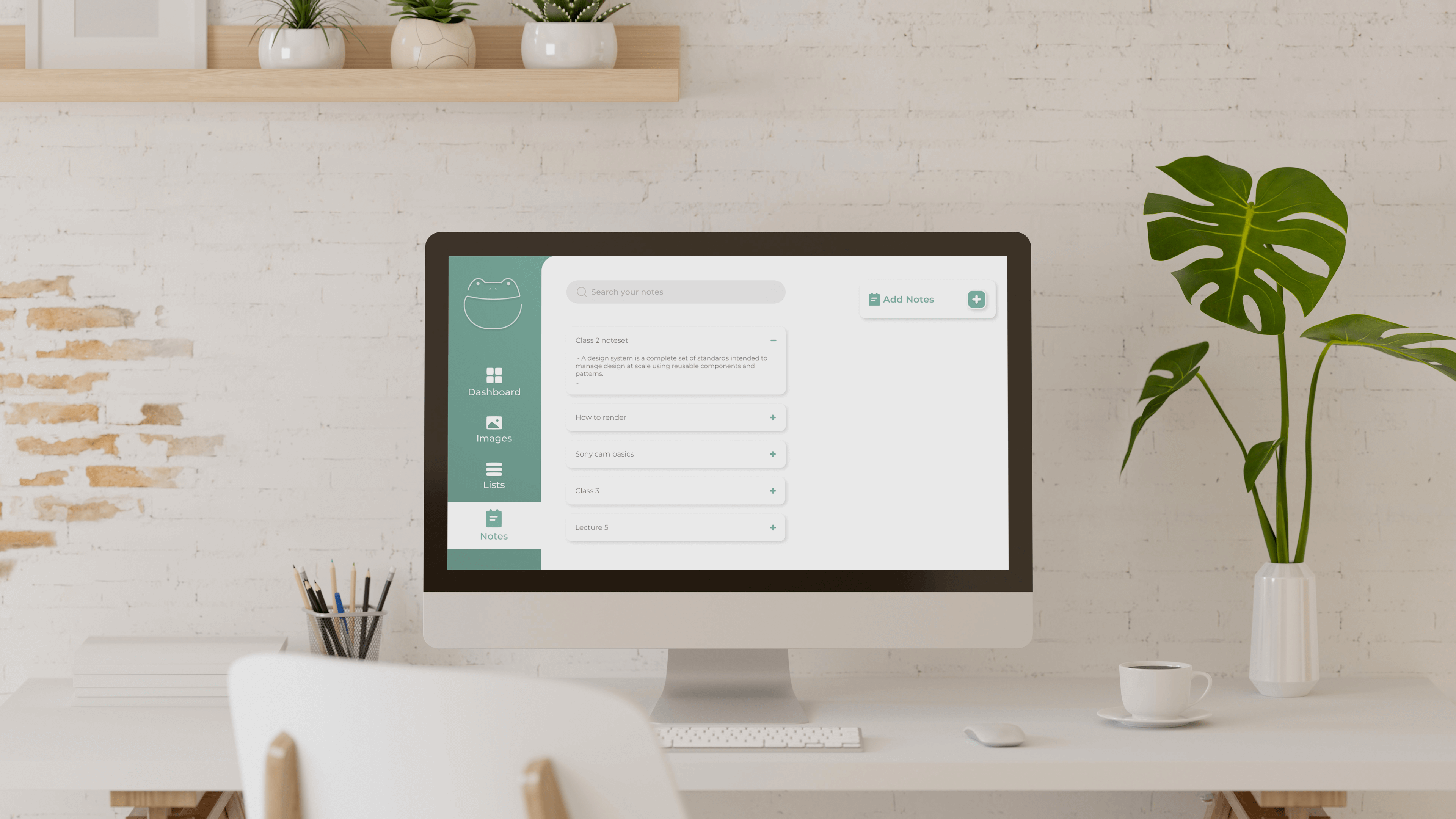
A fully functional note-taking web application. To get ideas and inspiration about what it is like using note-taking apps, we surveyed users as preliminary research. Unexpectedly, users were mainly struggling with the heaviness and robustness of the apps. Based on this result, we built a light, user-friendly app that doesn't overwhelm users with unnecessary features. We aim to keep things minimal for a smooth note-taking user experience.
Role
UX Research, Product Design
– Worked on desk research, user interviews, usability test and prototypes
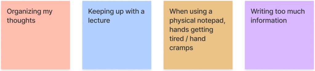
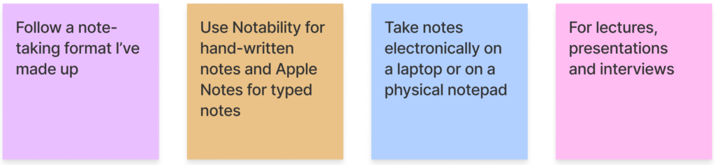
To understand what users think and need, we conducted a user survey. This step was crucial to the process since it helped us to get closer to our potential users and validate our assumptions about them. By asking open-ended questions, we could figure out what users’ pain points are, how they are dealing with them, and what solutions they are looking for in note-taking apps.
Focus area
◇ How do users currently go about taking notes?
◇ What are user’s biggest pain points related to the note-taking experience?
◇ How have they dealt with the pain points?
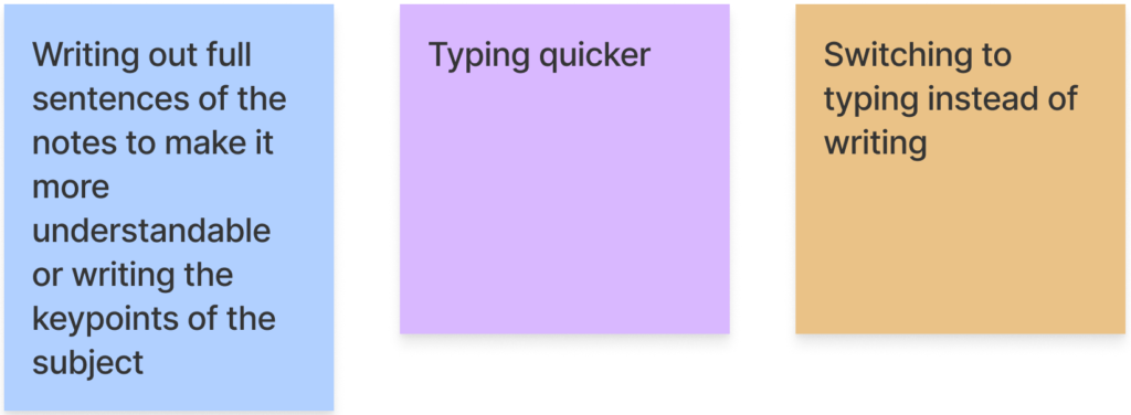
Through our user research and survey, we found out that users are shifting towards wanting simpler interfaces and functions.We fleshed out how the app would work and what features to implement for optimal use as a light, well-functioning note-taking app. Most of our target users want a simple user interface, so we stripped the unnecessary UI & features to fundamentals to make the app straightforward to use. There are three essential functionalities of our app:Write notes, Add photos, Create lists
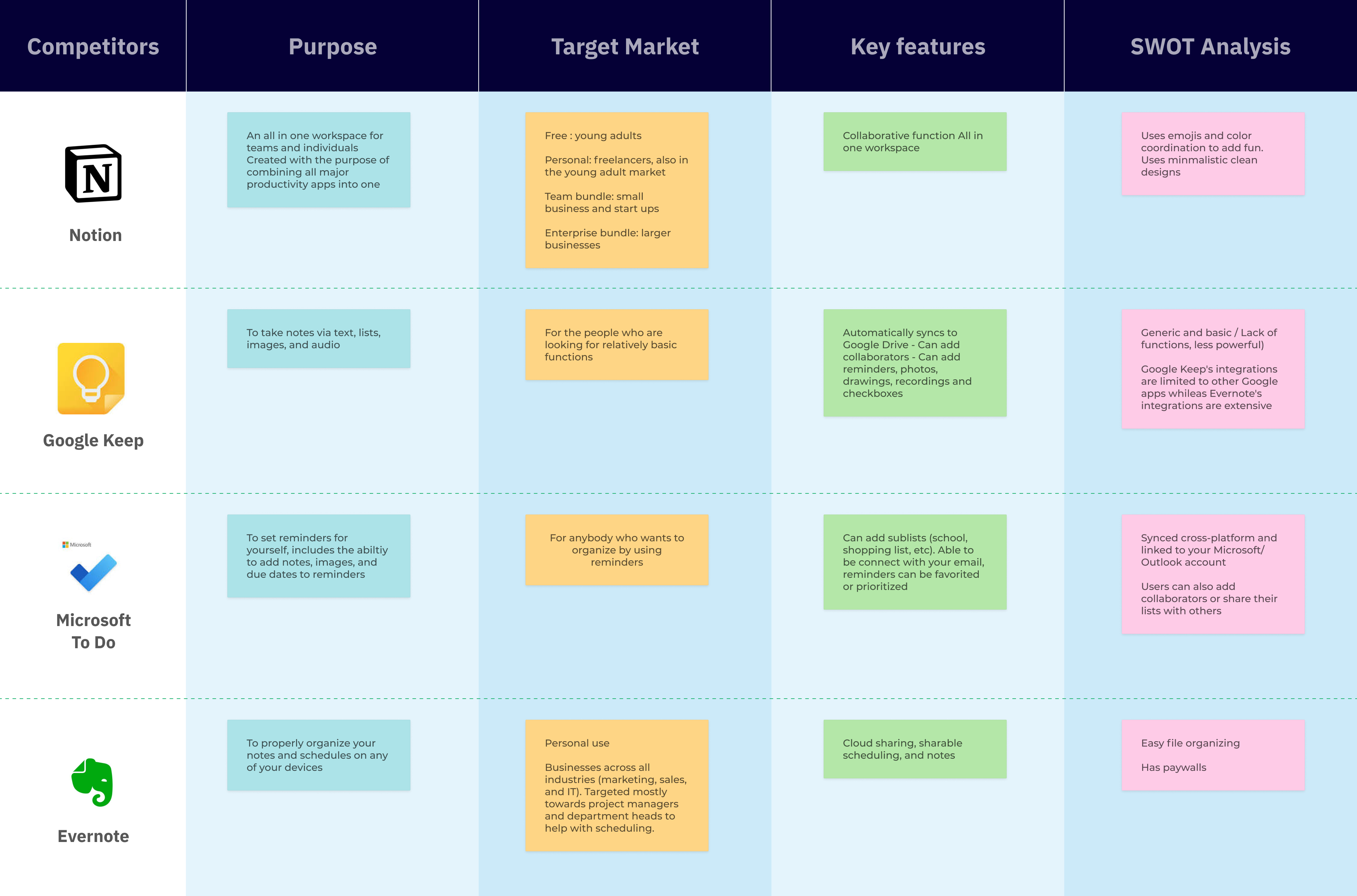
Competitive Analysis
To determine the unique positioning and strategy of our app, we conducted a competitive analysis. Since we aim to implement all features in both design and development, we considered what features we can include. Some apps like Evernote are on the heavy and robust side and more suitable for complex note-taking. On the other hand, Google Keep gears toward the users seeking simple features. Regardless, the common ground of what users want from note-taking apps is that users seek a smooth and easy user experience. One thing to note is that Notion has been becoming more and more popular due to its impeccable all-in-one productivity and flexibility.
2. Specify
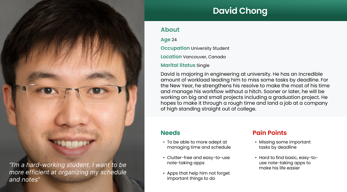
User Persona
Based on the user survey and research, I created a user persona. David is a university student struggling with a lot of workloads. He hopes to find an app that can help him manage his schedule and tasks with ease.
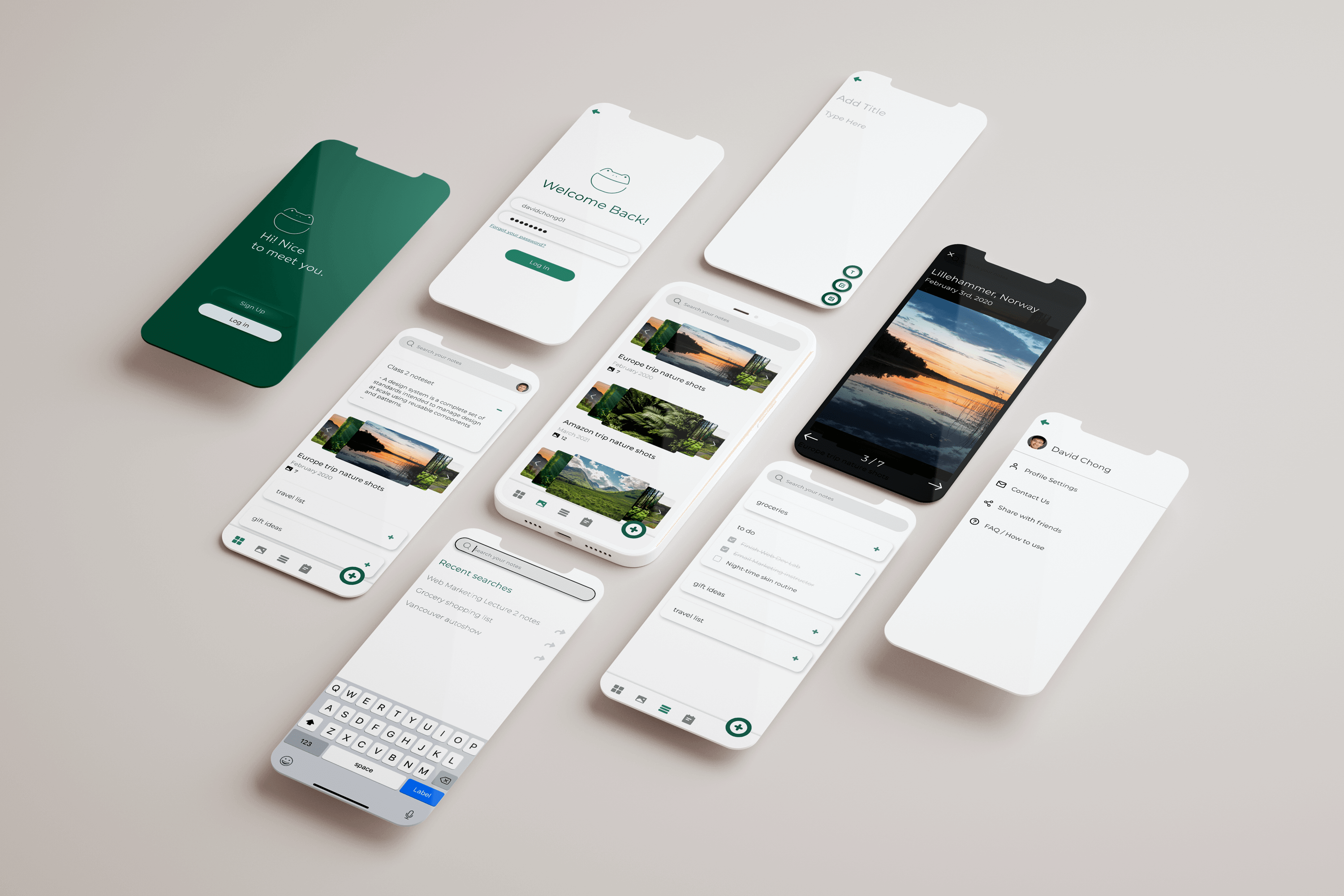
Heh is a supplementary notetaking web application designed with simplicity
in mind. The design keywords for Heh are clean, sleek, and simplistic. A clean UI will make it easy to navigate and save
notetakers' time.
Logo
Simplistic logo with the app name. The name of the application comes from the Egyptian God of
Infinity.
Colour palette
Neutral color and Primary color for the app. To maximize simplicity, secondary colors were not used.
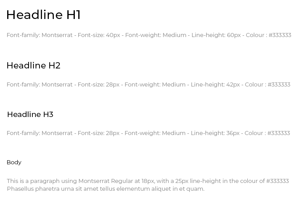
Typography
We chose a clean and simple sans-serif font to increase legibility. To avoid making the app look fragmented, I used a single typeface and a few font variants and sizes instead of using a couple of typefaces for this revision.
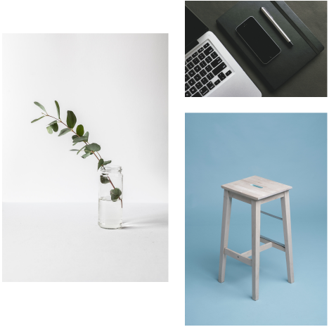
Images
Images are always 100% width of the container. The images are minimalistic
and applied without filter to match the concept behind the web application.
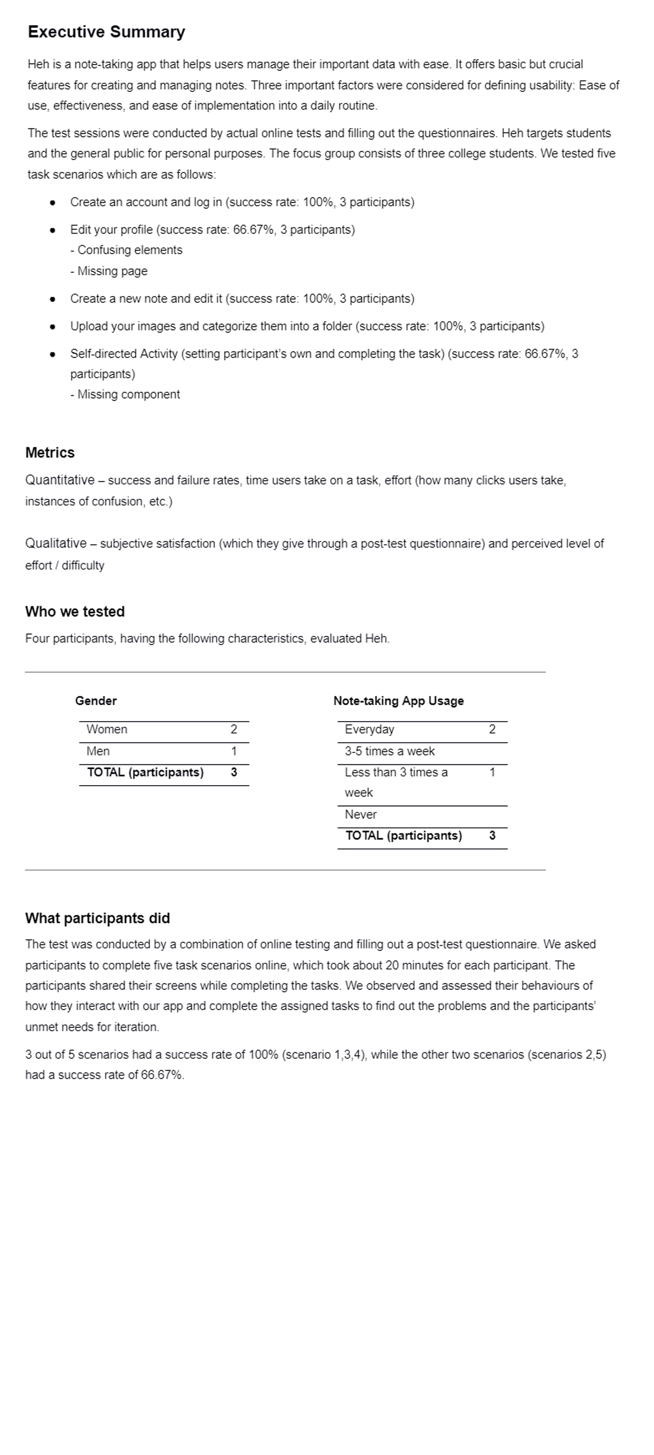
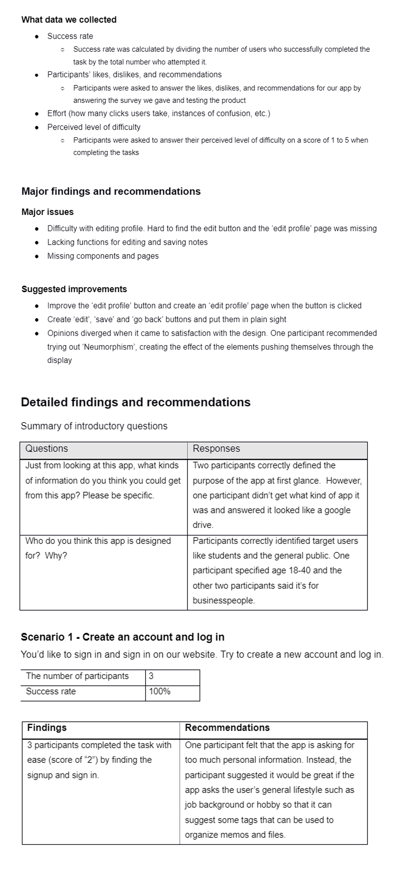
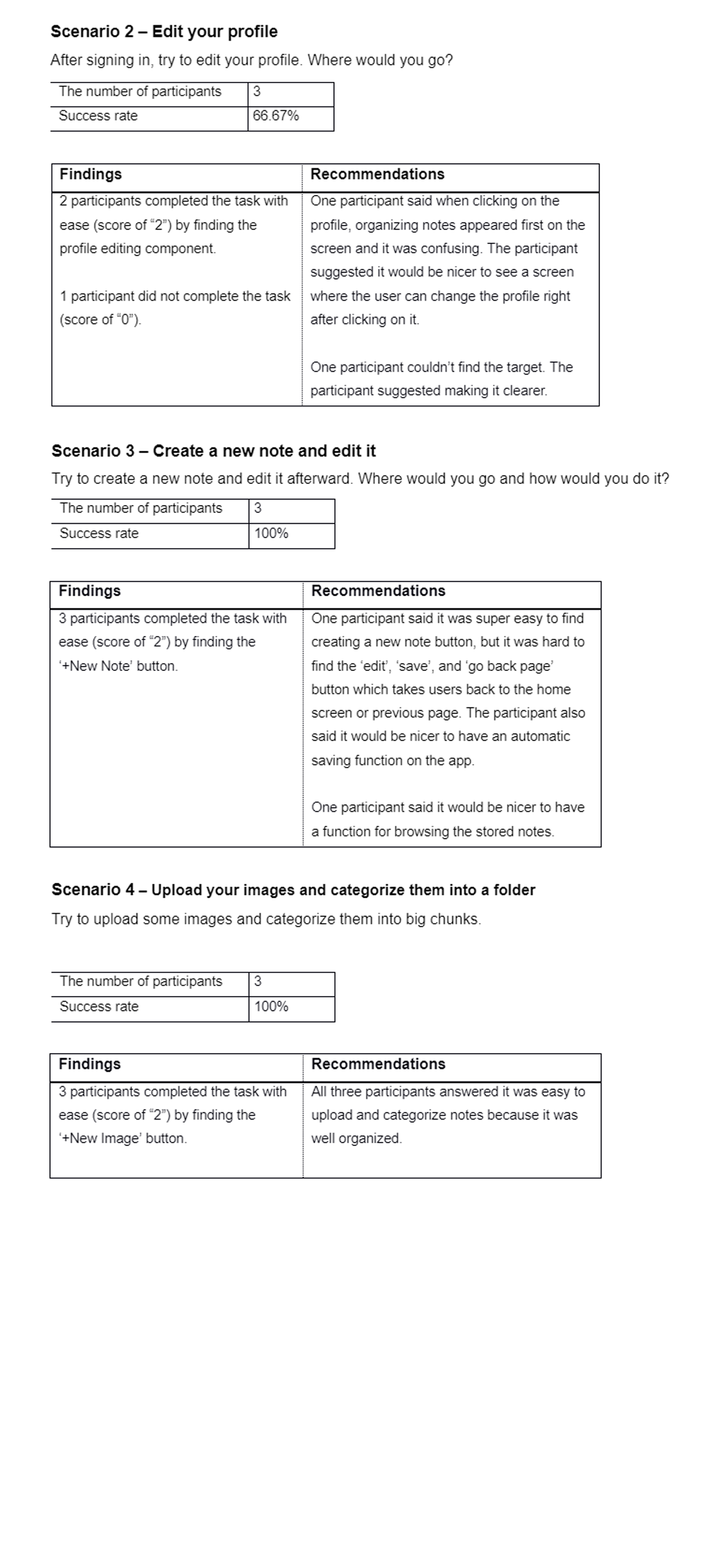
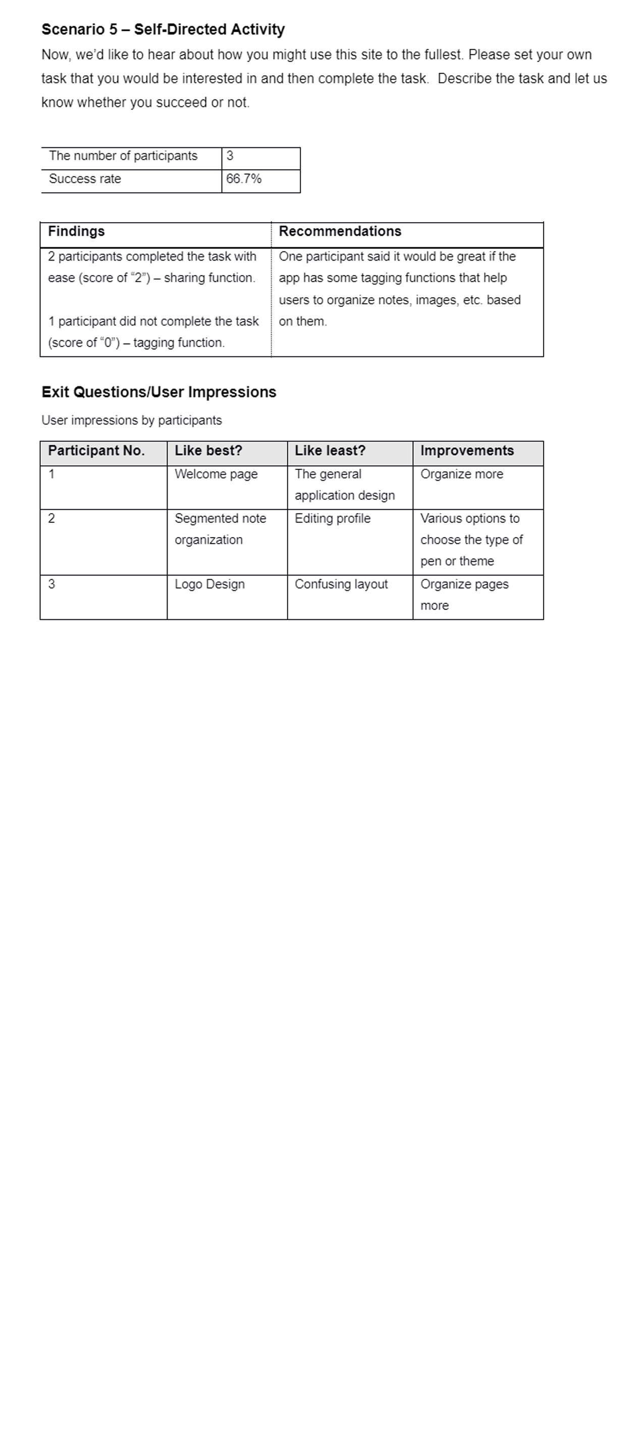
To validate assumptions about the user behaviors and identify problems, we conducted two rounds of usability tests. To collect qualitative and quantitative data, the test sessions were conducted by an actual online test and a post-test questionnaire.
We gave five scenarios to participants to complete the tasks. Through the test session and questionnaire, we found out what was confusing to them when using our product and how we could improve our product.
Takeaways
Listen to what users want
The more features don't necessarily mean the better. What users want is to find the right one that has the right features for them. We found out that many note-taking users need apps without much clutter where they can write things fast and easily. We paid attention to this and made an app that caters to their needs.